This is a similarity matrix which shows how similar a group's signatures are. The higher the score on the matrix, the more similar, the lower the score, the less similarities. This matrix can be found at http://www.biomedcentral.com/1471.2164/8/353/figure/F5?highres=y
Friday, December 12, 2008
This is a bivariate , standardized choropleth map depicting nominal data. The map shows both how voters voted as a percentage of a counties population as well as whether the county is considered rural or urban. This map can be found at http://portfolio.kelsocartography.com/albums/protfolio.kelsocartography.com/2006-b/vaSenate.jpg
This is a classes choropleth map meaning that the data have been organized into specific intervals. Since only one set of data is being presented, this is also a univariate choropleth map. The information shown is raw data that has not been areally averaged so this is an unstandardized map as well. This map of the amount of money paid by the government to individuals as incentive not to grow crops on their land can be found at http://portfolio.kelsocartography.com/albums/portfolio.kelsocartography.com/2008/FarmDay1Map.jpg
This is a range graded proportional circle map meaning depicting the number of burglaries in each area of Philidelphia. Each size circle represents a particular range of numbers, meaning that only the four sizes represent all numbers on the map. This map can be found at http://www.personal.psu.edu/users/t/i/tib105/GEOG486/lesson7_Baugh.htm
Tuesday, December 9, 2008
This is an isobar map that depicts Cyclone Grace coming ashore in Australia in 2004. It is from a website of someone's personal travel memoirs an can be found at http://www.summ.org/travels/014_to-sydney/2004
Saturday, December 6, 2008
This is a cartographic animation of sea level air pressures. The entire series moves through each month of the year to show the annual flow. The top map is of December and the bottom is of June. This map came from the University of Wyoming and can be viewed at http://uwacadweb.uwyo.edu/JSHINKER/animations/global/flash/mslp.html
This is a statistical map which depicts the percentage of change in residents of each state from the 1990 census to the 2000 census. Each shade of green represents a different amount of change which makes it easy to interpret general trends in regions of the country though it is not as helpful for more specific analyzation of data. The information from this map comes from the US Census Bureau and the map can be found at http://www.census.gov/population/cen2000/map02.gif
This cartogram depicts how many articles from each region were found in two current events magazines. These two particular representations are of The Australian and Slate. Each region on the map is scaled to represent how important each area is in the minds of the magazine's publishers. This map came from the website of a professor at the University of Montreal and it can be found at http://rs.resalliance.org/?s=cartogram
Sunday, November 16, 2008
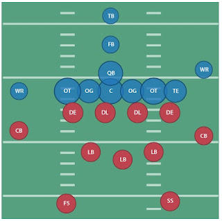
The circles on this proportional circle map convey several pieces of information. The placement of the circles depicts the formation of a football field and its players. Blue signifies offensive positions while red is defensive. The letters indicate the position of each player and the size of the circle is indicative of the score each position averages on the Wonderlic intelligence test (out of 50). htp://benfry.com/writing/archives/147
Thursday, October 23, 2008
Here is a map that shows infant mortality rates for various areas within San Diego. The map can be considered propaganda as it relates the mortality rates to mortality rates in other countries, some of which are developing. This map aims to influence opinions and possibly the actions of the viewer by playing upon emotions. http://go.owu.edu/~jbkrygie/krygier_html/geoe_222/geog_222_lo/geog_222_lolzgr/infantmortal.jpg
Thursday, October 2, 2008
This PLSS map is from the Bureau of Land Management. Is depicts the PLSS for Walton County, Florida, which just happens to be where I live. The BLM website that this comes from has maps at the state and county level for the PLSS. In conjunction with this information, one can find out where National Parks are, what areas are under Department of Defense control, and so on. http://geocommunicator.gov/LSIS6/map.jsp
This map is a cadastral map from 1736. It was used to delineate where in Montville, Connecticut the Mohegan Indians were granted rights to live. It is interesting to note that Britain ruled that the Mohegans' land consisted of much more than this area in Connecticut in 1705, however, that ruling was not implemented on this side of the Atlantic, as can be seen here. This is a great example of how land partitioning is a social institution. The bottom of the map consists of a note from the county surveyor asserting the legitimacy of the map. This map was originally on HistoryNYC.com, a map vendor. http://historynyc.com/products.asp?cat=53
This is a topographic map of the Grand Canyon, approximately the area that the National Park resides in. Just having returned from a trip to the Grand Canyon, this map has significance for me. Note how closely the contour lines are placed within the canyon, representing the sheer cliffs and steep walls. Contrast that with the sparse contour lines up on the rim of the canyon where the land is fairly flat. This map originally came from a link on a professor's web page that teaches a class in Physics at Davidson University in North Carolina. http://webphysics.davidson.edu/faclty/dmb/py220/grandcanyon/jpg
Thursday, August 28, 2008
Planimetric Map
This is a map of San Francisco made for tourists. I particularly like the use of a planimetric map here as it conveniently ignores that those tourists must do some strenuous walking up and down many hills in order to get anywhere.
http-//www.buysanfranciscotours.com/images/vista/city_sightseeing_route_map_san_francisco.gif
Subscribe to:
Posts (Atom)